Via — Natural Energy + Hydration Drink
Via is a global sports-energy beverage concept developed for a market dominated by artificial formulations and aggressive energy branding. The brief required a product that could communicate hydration, sustained energy, and natural ingredients within a single, globally legible identity system.
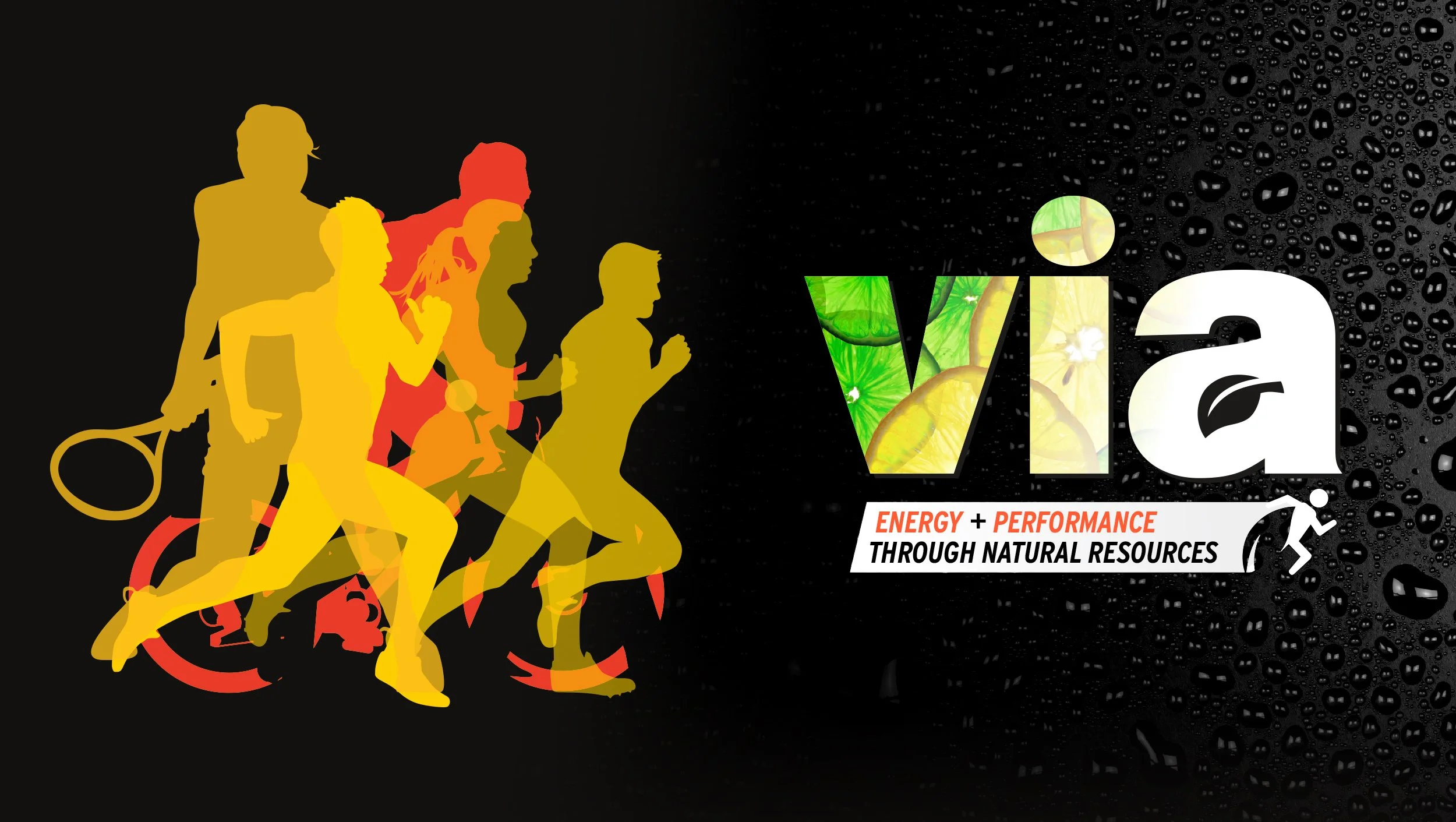
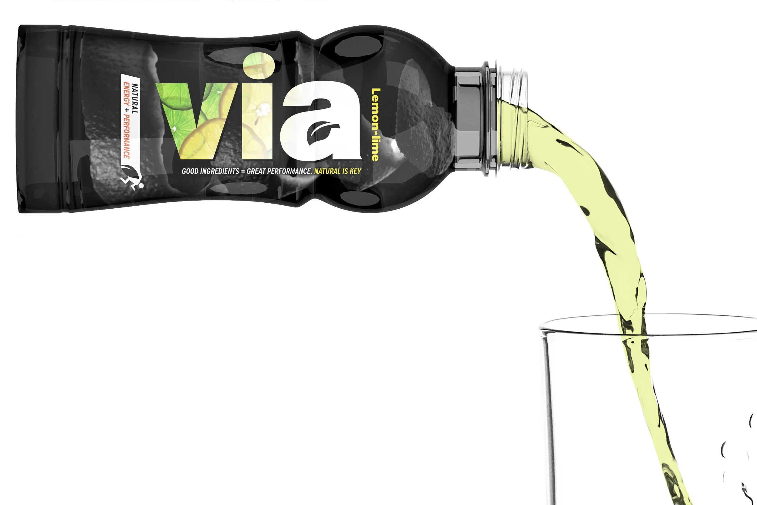
The name Via—derived from Latin meaning “through” or “pathway”—was selected to convey movement, experience, and performance across cultures. The identity was built around a bold, lowercase wordmark set in white on black to establish strong shelf presence while softening the tone of the brand. A condensation texture was applied to reinforce refreshment and cold activation at point of sale.
To communicate the product’s core differentiator—its all-natural formulation—a leaf form was integrated into the counter-space of the lowercase “a,” embedding the ingredient story directly into the wordmark. This became a defining insignia for the brand, supported by a secondary descriptor lockup reading “energy + performance through natural resources,” anchoring the system in clear functional messaging.
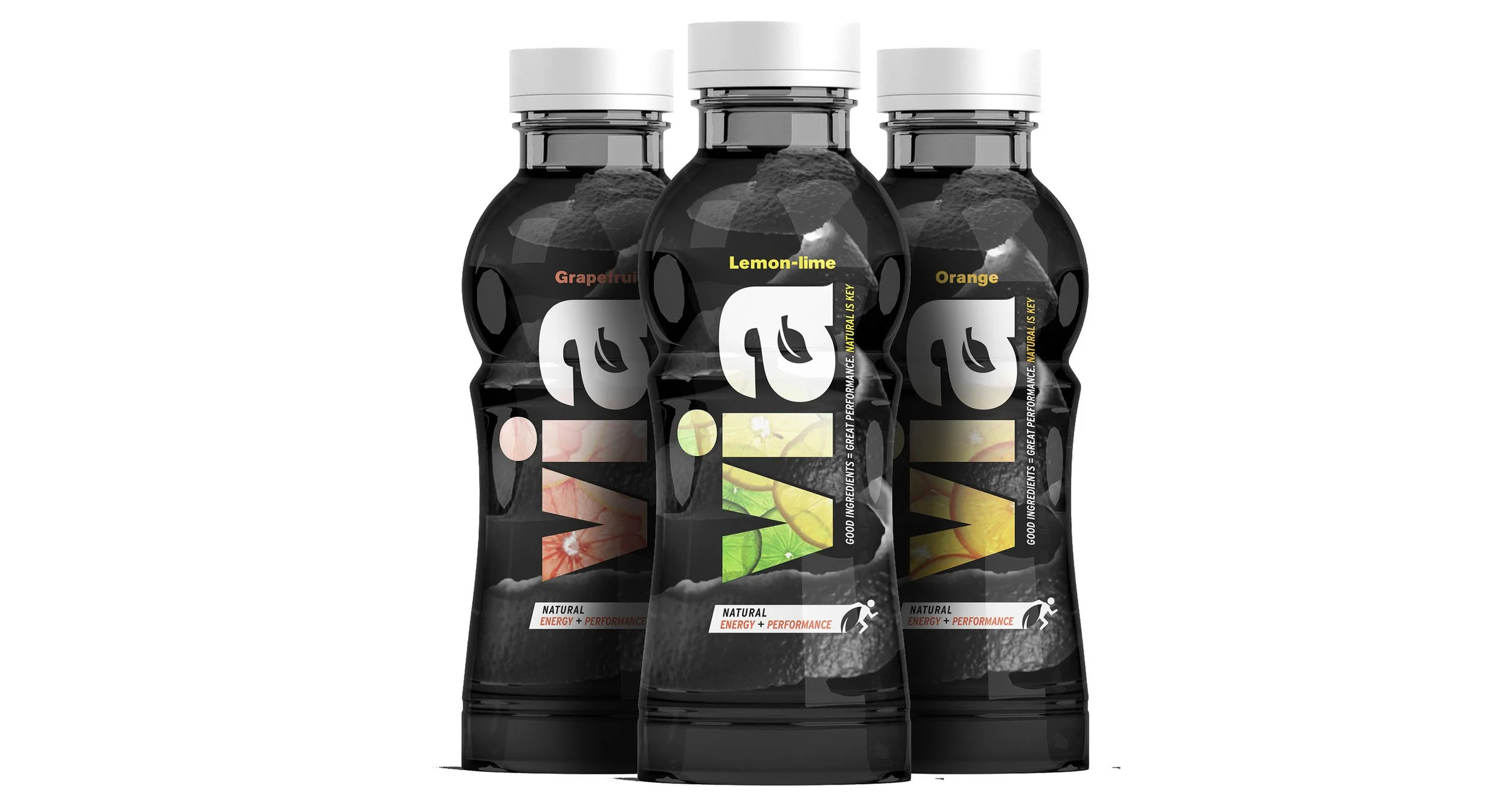
A system of three core flavor variants—Grapefruit, Lemon-Lime, and Orange—extended the identity across SKU architecture while maintaining a consistent visual language.
To express performance and versatility, a layered silhouette system of athletes in motion was developed, combining multiple sports disciplines into a single graphic field. This abstraction of movement positioned Via as a universal performance drink for all types of athletes, reinforcing endurance, energy, and adaptability.
Across all touchpoints, Via was positioned as a premium, naturally derived alternative within the sports-energy category—balancing clarity, restraint, and performance-driven design language.
Concept / Pitch Project (Agency Brief)